Anti-trends in kitchen design 2022: looking for alternative solutions
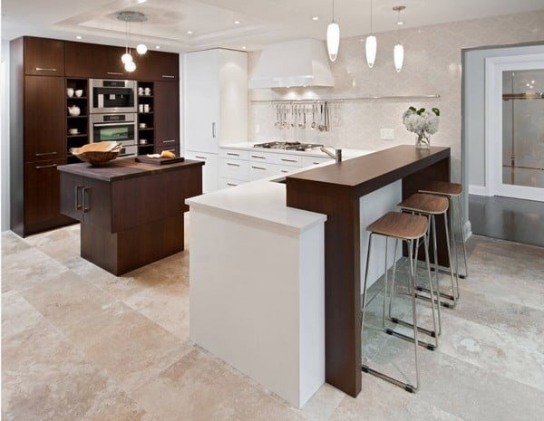 Today, the concept of trends in the interior is rather vague – the designers themselves speak about this. Over the past two or three years, no one has already required scrupulous observance of stylistic accuracy within the framework of one direction. A harmonious and balanced mix of details, a light touch of eclecticism, a sense of individuality – just such a design is relevant today.
However, this does not mean at all that absolutely any techniques are permissible in the design of a house or apartment today. There are certain trends that unobtrusively dictate options for arranging living space. They change over time, but the key principles are already known, on the basis of which the most fashionable interiors of kitchen 2022 will be created:
- free open spaces, an abundance of air and light;
- the most calm, relaxing color palette;
- laconic clear forms and clear lines;
- extremely moderate use of decor;
- priority of natural materials.
These trends are also true for kitchens, where gross stylistic mistakes are often made in decoration and furnishings. Designers suggest paying attention to solutions that should definitely be abandoned in 2022.
Bar counter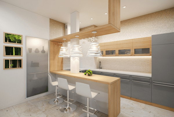
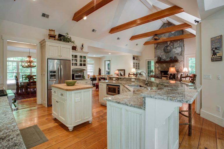
The bar counter as an element of kitchen design appeared in the arsenal of designers in the early 60s – and immediately became a real find for those who spend a lot of time outside the house and at the same time do not mind creating the atmosphere of a stylish loft in their apartment. However, time has shown its impracticality: it is inconvenient to gather with a large family at a narrow high table, and due to the growth in the number of bars and clubs, it becomes less and less necessary to equip a special area for an evening cocktail or a glass of wine at home.
What to prefer : If the area of the room allows, you should pay attention to the kitchen island, which is many times superior in functionality to the bar counter. The best option for a small kitchen is a comfortable ergonomic table and laconic light chairs.
Bright evocative colors
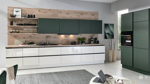
The time when everyone was crazy about catchy, “marker” colors for kitchen sets is over. Lime, bright turquoise, fire red, acid purple are now ostracized – primarily because of their ability to create psychological discomfort. Being in the kitchen with furniture “pluck out your eyes” can cause overexcitation and eye fatigue at the same time. Today, when peaceful coziness comes to the fore, such a color scheme is simply unacceptable.
What to Prefer : The best way to guess the color, both in terms of relevance and comfort, is to turn to the data of the Pantone Color Institute, which publishes predictions and recommendations on the actual colors for the next few months once a season. At the beginning of 2022, the fashionable palette is ready, and it offers the following shades:
- sandstone (Sandstone);
- almond (Almond Oil);
- wet snow (Sleet);
- deep blue (Blue Depth).
Also among the trendy are such complex tones as dusty rose, pale olive, mint, emerald and coffee.
Kitchen fronts with artsy finishes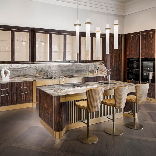
A classic set with facades decorated with spectacular carvings, metal elements and rhinestones (sometimes it happens) looks luxurious – however, the designers unanimously admit that such furniture is morally outdated. Ergonomics, comfort and restraint pleasing to the eye reign in trendy modern kitchens, and complex design looks alien and generally too much. What to prefer : The solution in this case is simple: laconic and smooth kitchen facades are appropriate in any setting – and even complex textures and patterns of wood (including such species as wenge and zebrano) will look organic. For those who carefully follow the trends in the interior, we can also recommend replacing furniture handles with a push-to-open system – convenient, practical and nothing superfluous.
Skinali with photo printing
Color printed glass kitchen aprons were at the height of fashion a little over a decade ago. What manufacturers did not offer was flowers of fantastic sizes, and panoramas of the night city, and sea views, and placers of fruits and vegetables, and flower meadows, and even something completely extravagant like black silhouettes emerging through the matte whiteness. As time has shown, such skins are extremely difficult to fit into any interior: they either make the design cheaper, or seem superfluous, or create a tiresome color ripple.
What to prefer : Today skins with photo printing have lost their position of a fashion trend, giving way to the following topical solutions:
- plain transparent or frosted glass;
- tile (first of all – “hog”);
- porcelain stoneware with a natural wood texture.
Another incredibly effective and stylish technique is a tabletop and an apron made of the same material. It can be natural stone or thin and extremely durable granite slabs with textures and shades of marble and polished concrete.
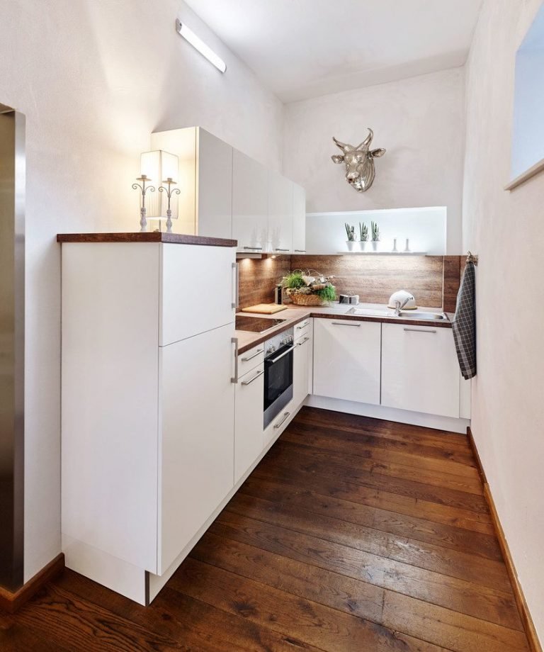
Glossy surfaces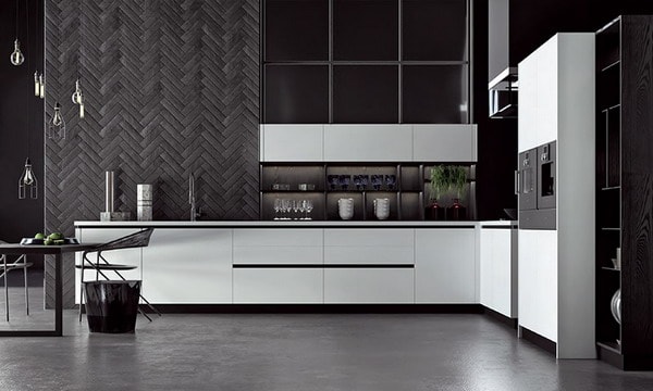
Gloss was another trend to be defeated in the run-up to 2022. Such surfaces contradict the key trend of the upcoming season – unconditional functionality and restraint. Facades, aprons and countertops with such a coating get dirty quickly and require constant maintenance – and the constant play of light over time is tiring and irritating. A glossy kitchen disposes neither to rest, nor to productive housework – only to the desire to constantly wipe everything that comes to hand.
What to prefer : Matt surfaces will not lose their relevance for a long time. And this is by no means something even and impersonal: painted wood and wood with an open texture, ceramics with a pattern for rocks, natural stone – you can set rhythm and harmony to the interior of the kitchen without any shine.
Textured wallpaper – and wallpaper in principle
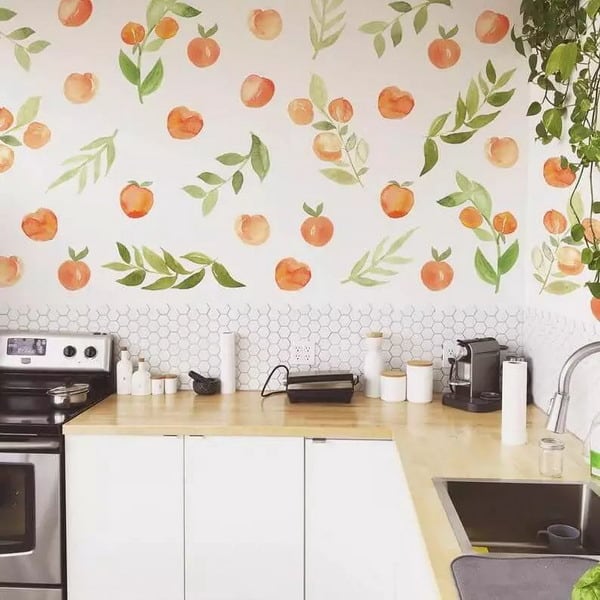
Already in 2020, any prints on the walls were recognized as irrelevant – geometric and classical, floral and abstract, small ornaments and maxi-format drawings, photo wallpaper and even art painting. Now the walls of the kitchen are proposed to be considered as a neutral background, allowing the textures and shades of furniture and interior items to unfold.
What to prefer : Simple wall painting. Moreover, with important conditions – such as the use of only high-quality paint, a competent selection of shades and perfect surface preparation.
Cluttered work areas
Often, housewives consider the kitchen as a personal space, in which everything that is necessary, convenient, expensive – and just like it should be at hand at once. All kinds of rails, coasters for kitchen utensils and tea sets, spice sets and flower pots, cutting boards and fruit vases – often all this is located in the kitchen work area at the same time. The “parade” of household appliances also deserves a separate discussion, when a coffee machine, a toaster, a bread machine, a blender and a yogurt maker are crowded on the tabletop. The problems with such an organization of space are obvious – it is a constant feeling of disorder, difficulty in preparing food and the need to constantly wash and wipe everything.
What to prefer : First of all – ergonomics. Replace versatile devices with multifunctional built-in appliances. When ordering a kitchen set, calculate its dimensions so that all utensils, dishes and food can fit in it. Set aside separate shelves for your favorite accessories and indoor flowers. The absence of unnecessary items on the work surfaces will create the necessary atmosphere of comfort and conciseness – just like on the covers of interior design magazines.
conclusions
Of course, everyone equips his kitchen the way he likes. However, it is still worth paying attention to anti-trends: today designers include solutions that can disrupt your visual, psychological and physical comfort and prevent the creation of a truly harmonious and cozy atmosphere.
