7 Key Rules For Children’s Interior Designs
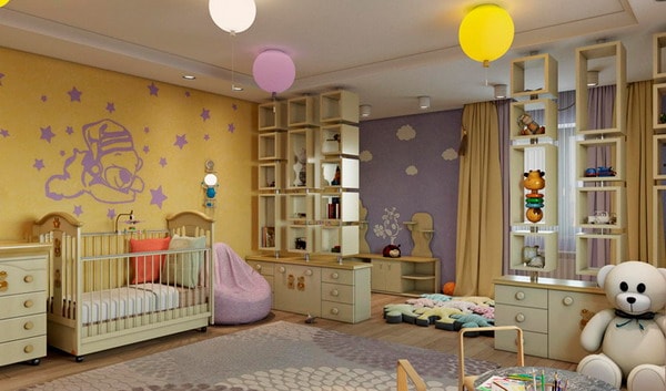 Today we will talk with you about the perfect interior design for children’s room. What nuances must be taken into account without fail at the stage of designing and thinking through the design of a nursery? After all, one must clearly understand and take into account: what a nursery should be like, what it can include and how to successfully arrange the space of the room. And this directly depends on: age, gender and from that one child or several children will live there.
Psychologists say that a well-thought-out design of the interior of a child’s room helps the progressive development of the baby and contributes to his formation as a person.
Today I will argue from the standpoint of mom and designer. What should you pay attention to at the stage of designing and repairing a children’s room?
Children’s Design – Safety And Practicality
Rule number 1 in the design of a children’s room. Firstly, it is the complete safety of the child. Secondly, it is 100% practicality in everything.
I am sure they will agree with this: both parents and psychologists.
After all, you can design the space so that there will be obstacles in the room, then sharp corners, then something else that can harm the child. In the same case, the child cannot be left in his room.
You simply can’t go to the toilet or the bathroom to wash your hands. Or we will think over the design of the children’s room so practical and safe for the baby that it can be left in your room while you are busy, for example, in the kitchen.
Children’s Design – Correct Zoning
Rule number 2 in the interior design of a nursery is the correct zoning of the room.
Here you need to understand that an adult, for example, has a bedroom only to sleep, well, to watch TV at most. But as for the children’s space, it is the totality of everything: to sleep, and play, and bring friends, and learn something new. After all, a child can construct, draw, do lessons or play the piano… It is also possible for him to want to climb the wall bars or just read books. And as you can imagine, all this should be in one room, including his personal belongings and his bed for sleeping.
It follows from this that it is important to correctly and thoughtfully zone the children’s room. First of all, you need to highlight the main areas of the nursery.
Children’s room zoning is a must-have Feng Shui for parents!
First, and this is one of the most important areas, is your child’s healthy sleep and relaxation area. The main object of this zone is a cozy children’s bed and everything connected with it.
Secondly, this is the area of the room where the child will sit at the table. That is to say – a working children’s space. Well, the main objects of this zone: – a table and a chair, and possibly a curbstone or shelf.
Thirdly, it is an area for storing children’s things and favorite toys.
And fourthly, as one of the main ones, this is the play area (so to speak, the availability of free space), even if the room is really small. This place is filled with a variety of games, board and floor games, games with peers and games with parents.
Nursery Design Is A Constant Transformation
Rule number 3 in the design and design of children’s space is a constant transformation of the room.
The nursery is neither a kitchen, nor a bedroom or a living room. This is a real transformer in motion as your child grows. Furniture, things, and semantic content change.
For example, if your child is under 1 year old he needs a specific set of things and furniture. But in the case of two or three years, a children’s table is added for the child’s creativity (modeling, drawing and similar things).
At the age of five to seven (usually this is preparation for the school stage), it is time to equip a full-fledged and comfortable workplace. Which naturally must be taken into account and included in the design of the nursery project. Plus books, notebooks, a school bag and correct posture in a comfortable and practical chair.
It should be noted (with regard to furniture) – the space of the nursery should constantly change once a year or two.
The child grows up and I am not a supporter of the fact that you need to buy some insanely expensive furniture in the children’s room, put it in headsets and assume that this furniture will stand here for 15 years!
This naturally will not happen, but in any case, everyone chooses according to their wallet and room size.
If we are talking about an ordinary average family, then you can buy middle segment furniture. The furniture is inexpensive, the same furniture from IKEA and you can easily change it, for example, after 2 years. In this case, you will not be excruciatingly hurt that you spent a large amount of money. After all, then you simply will not need this furniture – because the child has grown.
Also, an important fact is that we definitely pay attention to whom this room is intended for, that is, gender – boy, girl, twins. How many people will live in it. It should also be borne in mind that if children are planned in the near future for two to three years, then it must be taken into account now when repairing. Think carefully about where you will put the extra bed and any other necessary furniture items for the second or third child.
Nursery Design – Your Child’s Health
Rule # 4 in designing a child’s room is the health of the child.
High-quality design of a nursery is a guarantee of your child’s health! So let’s take a closer look at this aspect.
Firstly, it is a quiet and healthy sleep of the baby and everything connected with it. In a dream, the child gains strength and energy, the growth of the baby also takes place during sleep, so this is really important.
There is one trendy mistake many parents make. As if in taking care of the baby’s sleep, they get an expensive bed with lurid marketing design gimmicks. But! But at the same time, they take a mediocre mattress with their heads held high..
Baby’s sleep quality – the best mattress is more important than the best bed!
Personally, I adhere to a completely different position. The bed in general can be simple and elementary. What’s even better – it was personally created by the hands of a “loving dad” and fit well in size into the interior. But the mattress should be very, very fundamentally high quality! After all, this is the most important factor in your child’s healthy sleep. For it to grow and develop correctly, choose an anatomical, completely natural mattress. Hypoallergenic and breathable, – relieves physical fatigue and allows you to maintain the baby’s spine in the correct position.
The mattress is only anatomical, completely natural and hypoallergenic!
Secondly, the naturalness of the materials. Now let’s talk a little about finishing materials. Of course, every parent wants the best for their child. We as designers at the design stage, and then at the stage of renovating a children’s room, must take this into account.
Environmental friendliness and safety of materials – 100% as possible!
Eco style, as if it was born in the children’s room =) Children’s design is the most embodied eco-direction!
For the floor of your baby’s room – the best fit: parquet board, cork coverings and only natural materials! It is comfortable, warm and hypoallergenic. And so, everyone has the right to their choice and environmental, ethical and economic beliefs.
Children’s Design – Measured Colors
Rule number 5 in the interior design of a nursery is a measured color palette.
Wall covering in the interior design of a room for small children should be, above all, practical. After all, children love, from time to time, to make drawings on the walls, to throw something at them or just to get dirty. Nobody will cancel cosmetic repairs in 3-4 years. Hence, we draw conclusions: at the earliest stage, provide for the possibility of cosmetic repairs in the “near future”.
Wall coverings with paint are a little more expensive, but more practical than wallpaper. You can always just paint it in a different color, right on top of the old paint (if your walls are initially well prepared).
The design of the room for the baby is the calm color atmosphere of the walls and the harmony of the whole room as a whole. Perhaps someone disagrees, but! It is best to dilute the solid color wall covering with your children’s achievements.
Children love to show what they have done. Be it a postcard that was made in the kindergarten for mom on March 8, or the first drawings. It really dilutes the solid walls very cool. And believe me, these are the right accents that form not only the brightness of the decor, but also the warmth of family warmth.
Where the child is, there are many different colored things!
Calm colors mean calmness and harmony in studies, healthy sleep and stronger nerves. Many people say that oh, what a boring color – light beige monochromatic tones in the nursery – but the opposite is true. Multi-colored “pluck out your eyes” toys will always replenish the balance in space.
Children’s Design – Multifunctionality
Rule # 6 in nursery design is multifunctional furniture.
It should be noted that a successful children’s design project is the presence of self-transforming, multifunctional furniture. Now the trend is just high-rise beds, or, as an option, bunk beds. The latter is ideal if you have two children. You can place the bed down and up. If you have a child, it is advisable to place the child’s bed in such a way as if it were his own house – a cozy corner on the “second floor”. In this option, you can make a play area below, or put some kind of sofa-sofa so that there is a place where the child can sit with his friends, not counting the bed.
And one moment. Let’s say your nursery design is designed so that there is a lot of large-sized furniture in the interior, in this case, be sure to attach it firmly to the walls. Children love to play with boxes, climb into them, or something more – boys climb like climbers on furniture while not looking after them.. But furniture – often falls over on children, and with very deplorable results..
Your child’s safety comes first! Better to be safe on the shore and be calm..
When planning the purchase of furniture for the nursery, it must be remembered that this space is often reorganized. And the furniture will simply be rearranged. In general, it is better to take light “universal furniture” that is not strongly age-related.
Nursery Design – Mobile Decor
Rule # 7 in children’s interiors is the comfort of a moving decor.
The decor in the nursery does not have any special restrictions on decoration. Everything is very individual, depending on the age and gender of your child. Otherwise, you can use some posters or a map of the world (and at the same time plan a trip, as an option, why not ?!). But intellectual development maps are better suited for an older audience. The “cute” animals on the wall are perfect for everyone, especially for the younger audience.
The main thing in the decor is the coziness and comfort of a baby or teenager. Listen to your children more often. Watch your children what they like and what they don’t. This will help create a cool, suitable nursery design and fill the interior in the best possible way with everything in mind. Harmonious interaction for you and successful renovation of the children’s room.


